Package selection guidance compiled from public package information, community data, and project usage.
BottomNavyBar is a visually appealing and animated bottom navigation bar for Flutter applications. It seamlessly integrates with the app's current theme while offering extensive customization options for colors, icons, and animations. Designed for modern UIs, it enhances user experience with smooth transitions and responsive feedback across all platforms. The package supports Android, iOS, Web, macOS, Windows, and Linux, making it ideal for cross-platform development. Its clean, intuitive design makes it perfect for apps requiring a sleek bottom navigation interface.
Use cases
Mobile and web apps with bottom navigation
Cross-platform applications
Modern UI designs
E-commerce and social media apps
Dashboard interfaces
Key features
Animated navigation transitions
Theme-aware styling
Customizable colors and icons
Responsive design across platforms
Smooth user interaction
Support for multiple platform targets
Suitable for
Developers seeking elegant bottom nav bars
Apps targeting multiple platforms
Design-focused Flutter projects
Projects requiring animated UI elements
Teams prioritizing user experience
Considerations
May require additional styling for complex themes
Limited to bottom navigation use case
Animation performance should be tested on lower-end devices
Not suitable for top or side navigation layouts
Customization may increase code complexity
Original README
Original README snapshot from the linked source repository. Visit the repository for the latest content.
BottomNavyBar
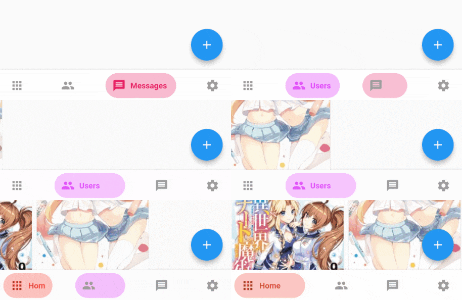
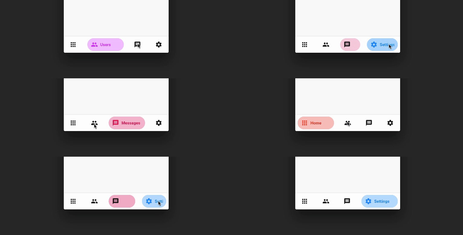
A beautiful and animated bottom navigation.
The navigation bar uses your current theme, but you are free to customize it.
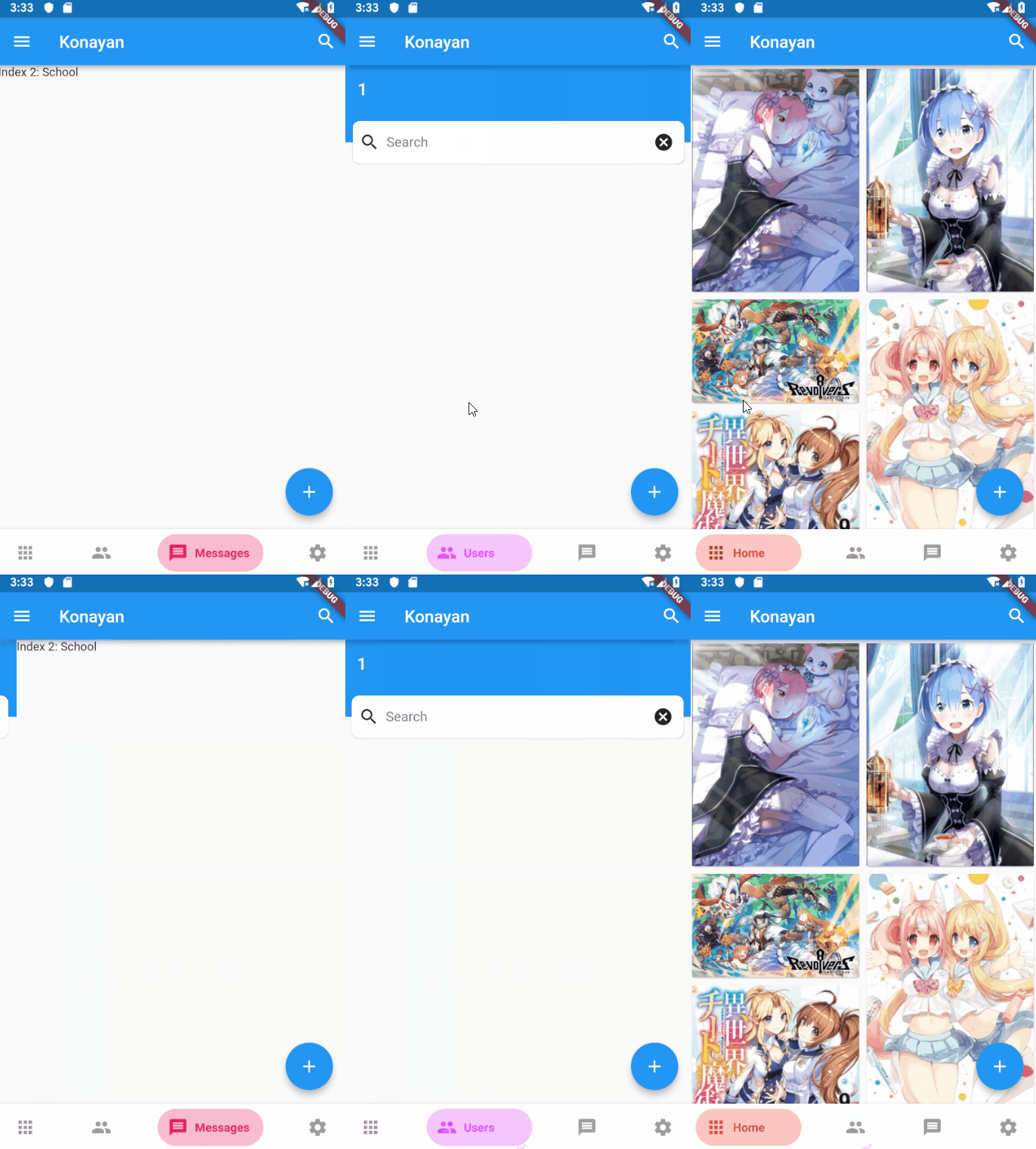
Preview
PageView
Customization (Optional)
BottomNavyBar
iconSize - the item icon's size
items - navigation items, required more than one item and less than six
selectedIndex - the current item index. Use this to change the selected item. Defaults to zero
onItemSelected - required to listen when an item is tapped it provides the selected item's index
backgroundColor - the navigation bar's background color
showElevation - if false the appBar's elevation will be removed
mainAxisAlignment - use this property to change the horizontal alignment of the items. It is mostly used when you have ony two items and you want to center the items
curve - param to customize the item change's animation
containerHeight - changes the Navigation Bar's height
showInactiveTitle - use this property show a Inactive titles. Defaults to false.
BottomNavyBarItem
icon - the icon of this item
title - the text that will appear next to the icon when this item is selected
activeColor - the active item's background and text color
inactiveColor - the inactive item's icon color
textAlign - property to change the alignment of the item title
activeBackgroundColor - the active item's background color
activeTextColor - the active item's text color
tooltipText - the tooltip text that will appear when the item is long pressed
Contributions of any kind are more than welcome! Feel free to fork and improve in any way you want, make a pull request, or open an issue.
See CONTRIBUTING.md for more info on how to contribute to this project.
License
This project is licensed under the Apache-2.0 License - see the LICENSE file for details.