Search packages, repositories and app categories

credit_card_input_form cover
Package detailsv2.3.0

credit_card_input_form

This package provides visually beautiful UX through animation of credit card information input form.

AndroidiOS
30-day downloads
138
Likes
62
Pub points
110

Install package

flutter pub add credit_card_input_form

Package Overview

Package selection guidance compiled from public package information, community data, and project usage.

A Flutter package that delivers an aesthetically pleasing and animated credit card input form, enhancing user experience during payment data entry. It features smooth animations and real-time visual feedback as users type card details, improving engagement and reducing input errors. Designed with modern UI principles, it supports both Android and iOS platforms, offering a polished look out of the box. The package is ideal for apps requiring secure and intuitive card information collection.

Use cases

  • Payment processing forms
  • E-commerce checkout flows
  • Mobile banking applications
  • Digital wallet integrations
  • User onboarding with card setup

Key features

  • Animated card number input
  • Real-time card type detection
  • Smooth visual transitions
  • Responsive design for all screen sizes
  • Built-in placeholder animations

Suitable for

  • Developers seeking polished payment UIs
  • Apps focused on user experience in financial workflows
  • Projects requiring minimal setup for card input

Considerations

  • Does not include backend payment processing
  • Requires manual handling of sensitive data security
  • Limited customization beyond styling
  • No built-in validation beyond format checks

Original README

Original README snapshot from the linked source repository. Visit the repository for the latest content.


This package provides visually beautiful UX through animation of credit card information input form.

Preview

Installing

  1. Add dependency to pubspec.yaml

    Get the latest version in the 'Installing' tab on pub.dartlang.org

dependencies:
    credit_card_input_form: ^2.3.0
  1. Import the package
import 'package:credit_card_input_form/credit_card_input_form.dart';
  1. Adding CreditCardInputForm

With optional parameters

 CreditCardInputForm(
   cardHeight: 170,
   showResetButton : true,
   onStateChange: (currentState, cardInfo) {
     print(currentState);
     print(cardInfo);
   },
   customCaptions: {...}, 
   frontCardDecoration: cardDecoration,
   backCardDecoration: cardDecoration,
   prevButtonDecoration: buttonStyle,
   nextButtonDecoration: buttonStyle,
   resetButtonDecoration : buttonStyle,
   prevButtonTextStyle: buttonTextStyle,
   nextButtonTextStyle: buttonTextStyle,
   resetButtonTextStyle: buttonTextStyle,
   initialAutoFocus: true, // optional

),

How to use

Check out the example app in the example directory or the 'Example' tab on pub.dartlang.org for a more complete example.
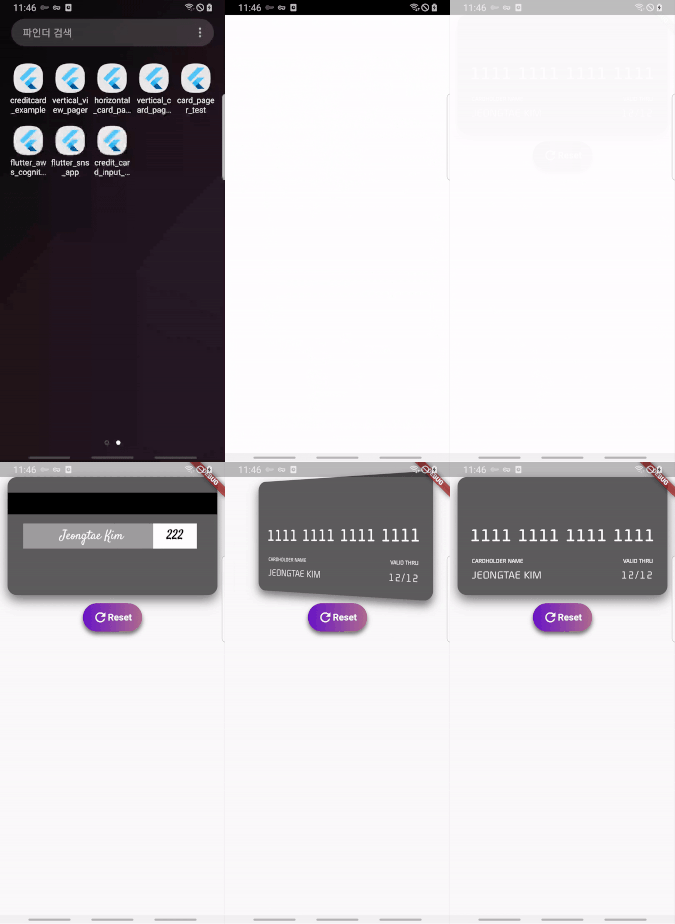
New Feature

v1.3.0

added custom button style feature

Default Custom
default custom
final buttonDecoration = BoxDecoration(
    borderRadius: BorderRadius.circular(30.0),
    gradient: LinearGradient(
        colors: [
          const Color(0xfffcdf8a),
          const Color(0xfff38381),
        ],
        begin: const FractionalOffset(0.0, 0.0),
        end: const FractionalOffset(1.0, 0.0),
        stops: [0.0, 1.0],
        tileMode: TileMode.clamp),
  );

  final buttonTextStyle =
      TextStyle(color: Colors.white, fontWeight: FontWeight.bold, fontSize: 18);

  CreditCardInputForm(
    prevButtonDecoration: buttonDecoration,
    nextButtonDecoration: buttonDecoration,
    prevButtonTextStyle: buttonTextStyle,
    nextButtonTextStyle: buttonTextStyle,
    resetButtonTextStyle: buttonTextStyle,
  ),

v2.0.0

It provides more options using boxdecoration that can only change the color of the card.

Default Custom
image image
  final cardDecoration = BoxDecoration(
    boxShadow: <BoxShadow>[
      BoxShadow(color: Colors.black54, blurRadius: 15.0, offset: Offset(0, 8))
    ],
    gradient: LinearGradient(
        colors: [
          Colors.red,
          Colors.blue,
        ],
        begin: const FractionalOffset(0.0, 0.0),
        end: const FractionalOffset(1.0, 0.0),
        stops: [0.0, 1.0],
        tileMode: TileMode.clamp),
    borderRadius: BorderRadius.all(Radius.circular(15)));


    CreditCardInputForm(
      frontCardDecoration: cardDecoration,
      backCardDecoration: cardDecoration,
    ),
  ]),
v2.1.0

implement a new feature to add an initial value when creating a widget

Code Preview
CreditCardInputForm(
  ....
  cardCVV: '222',
  cardName: 'Jeongtae Kim',
  cardNumber: '1111111111111111',
  cardValid: '12/12',
  intialCardState: InputState.DONE,
),

ezgif com-gif-maker

v2.2.0

Add initialAutoFocus parameter

3rd party library

Flip card

https://pub.dev/packages/flip_card

For use card flip animation

Provider

https://pub.dev/packages/provider

For use state management

Reference

This package's animation is inspired from from this Dribbble art

TODO List

  • [x] add RESET button
  • [x] add box decoration param

Categories

Dependencies

Dependency list 2 items

Source repository

Projects using this package

No data available yet.