Search packages, repositories and app categories

flip_card cover
Package detailsv0.7.0

flip_card

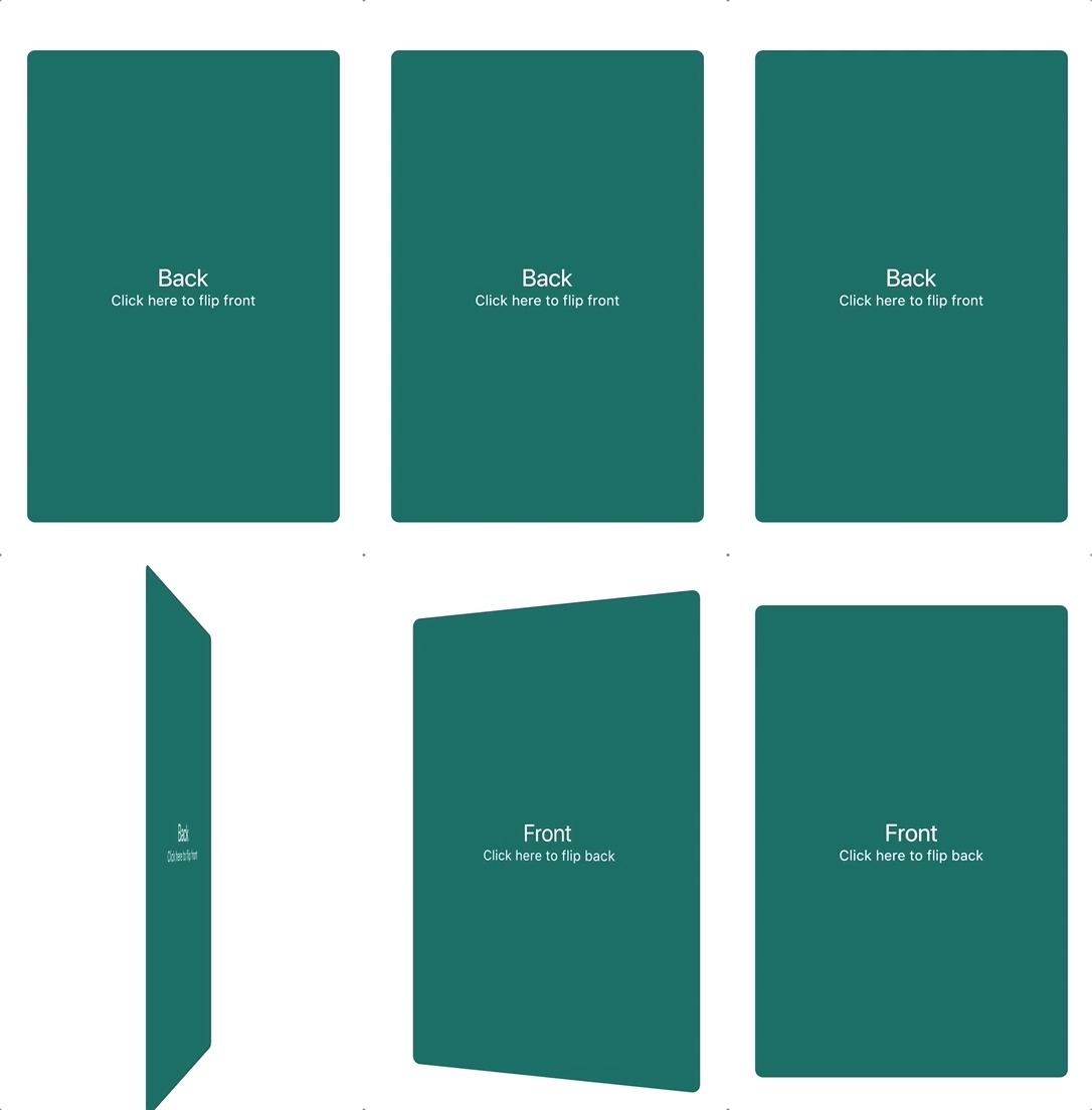
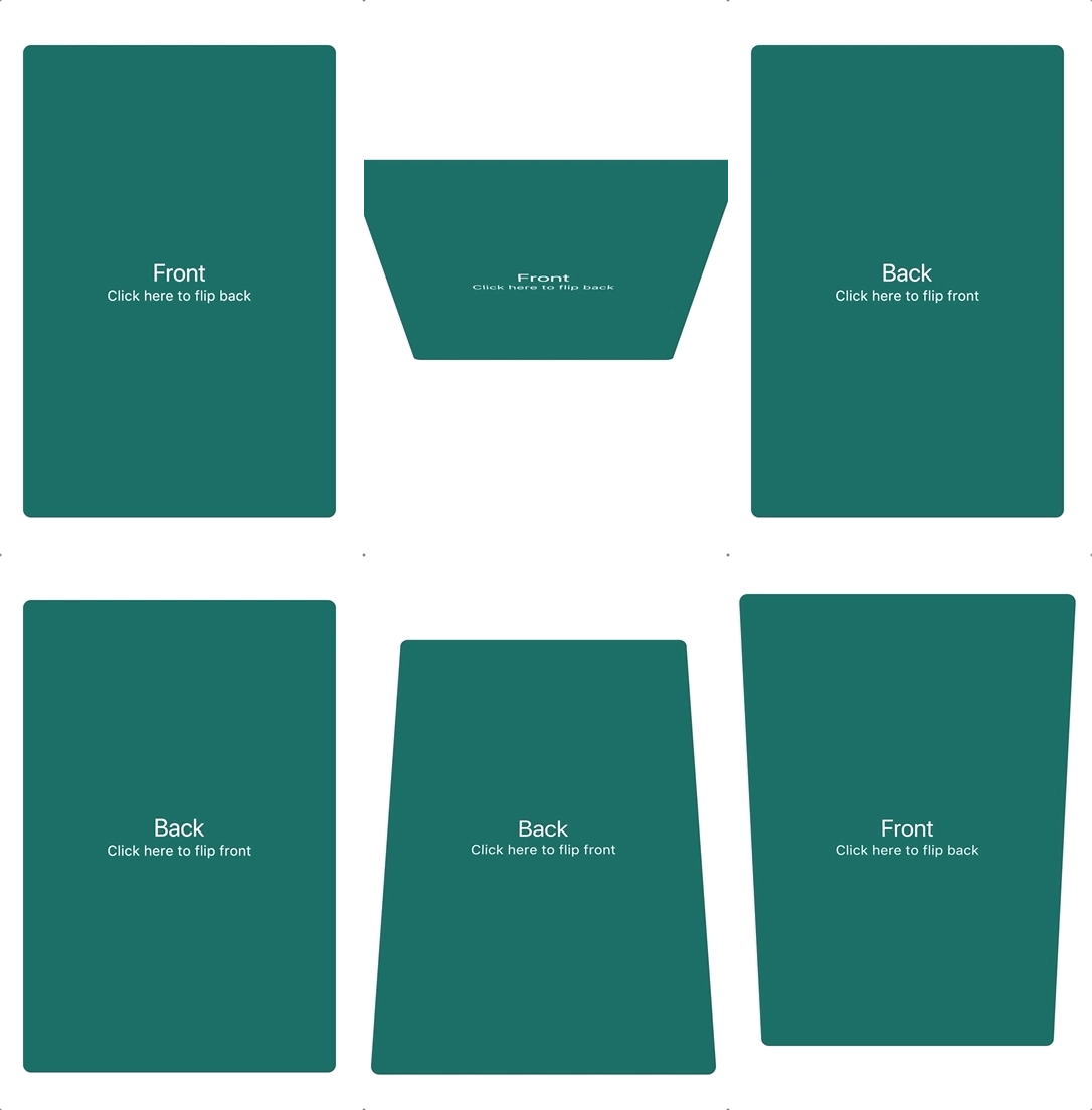
A component that provides flip card animation. It could be used for hide and show details of a product.

AndroidiOSWebmacOSWindowsLinux
30-day downloads
96.4K
Likes
956
Pub points
135

Install package

flutter pub add flip_card

Package Overview

Package selection guidance compiled from public package information, community data, and project usage.

FlipCard is a Flutter package that enables smooth flip card animations, ideal for revealing additional information such as product details. It supports interactive flipping with customizable front and back widgets, making it perfect for engaging user interfaces. The package works across all major platforms including Android, iOS, Web, macOS, Windows, and Linux, ensuring consistent behavior. With simple integration via pub add, it enhances UI interactivity without complexity.

Use cases

  • Product detail reveal
  • Interactive learning cards
  • Before/after comparison
  • User profile toggles
  • Gamified UI elements

Key features

  • Smooth flip animation
  • Customizable front and back content
  • Cross-platform support
  • Easy integration with Flutter
  • Gesture-based flipping
  • Configurable speed and direction

Suitable for

  • E-commerce apps
  • Educational apps
  • Interactive tutorials
  • Dashboard widgets
  • UI prototyping

Considerations

  • May impact performance on low-end devices
  • Requires careful design for accessibility
  • Limited to 2D flipping effects
  • Not suitable for complex transitions
  • Animation may conflict with other gestures

Original README

Original README snapshot from the linked source repository. Visit the repository for the latest content.

flip_card PRs Welcome Pub Package

A component that provides a flip card animation. It could be used for hiding and showing details of a product.

How to use

Import the package

import 'package:flip_card/flip_card.dart';
Default

Create a flip card as shown below. By default the card is touch controlled.

You can turn off touch control by setting flipOnTouch to false.

FlipCard(
  fill: Fill.fillBack, // Fill the back side of the card to make in the same size as the front.
  direction: Axis.horizontal, // default
  initialSide: CardSide.front, // The side to initially display.
  front: Container(
    child: Text('Front'),
  ),
  back: Container(
    child: Text('Back'),
  ),
)
Programmatically
Controller (Recommended)

To control the card programmatically, you can pass a controller when creating the card.

late FlipCardController _controller = FlipCardController();

@override
Widget build(BuildContext context) {
  return FlipCard(
    controller: _controller,
    front: ...,
    back: ...,
  );
}

void doStuff() {
  // Flip the card a bit and back to indicate that it can be flipped (for example on page load)
  _controller.hint(
    duration: const Duration(milliseconds: 400),
  );

  // Tilt the card a bit (for example when hovering)
  _controller.skew(0.2);

  // Flip the card programmatically
  _controller.flip();

  // Flip the card to front specifically
  _controller.flip(CardSide.front);

  // Flip the card without animation
  _controller.flipWithoutAnimation();
}
Global Key

You can also control the card via a global key as shown below.

This is not the recommended way.

final cardKey = GlobalKey<FlipCardState>();

@override
Widget build(BuildContext context) {
  return FlipCard(
    key: cardKey,
    flipOnTouch: false,
    front: Container(
      child: RaisedButton(
        onPressed: () => cardKey.currentState.toggleCard(),
        child: Text('Toggle'),
      ),
    ),
    back: Container(
      child: Text('Back'),
    ),
  );
}
Timed

You can auto-flip the widget after a certain delay without any external triggering.

FlipCard(
  fill: Fill.back, // Fill the back side of the card to make in the same size as the front.
  direction: Axis.horizontal, // default
  initialSide: CardSide.front, // The side to initially display.
  front: Container(
    child: Text('Front'),
  ),
  back: Container(
    child: Text('Back'),
  ),
  autoFlipDuration: const Duration(seconds: 2), // The flip effect will work automatically after the 2 seconds
)

Categories

Source repository

Projects using this package