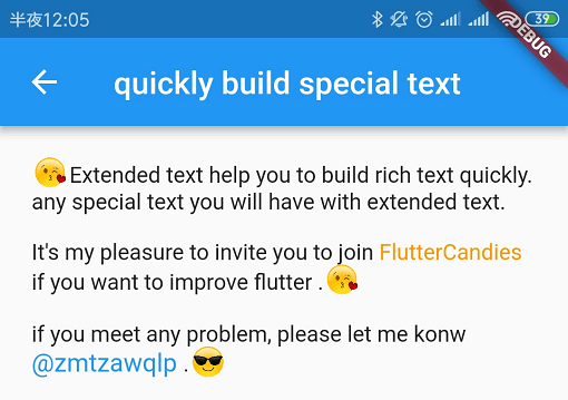
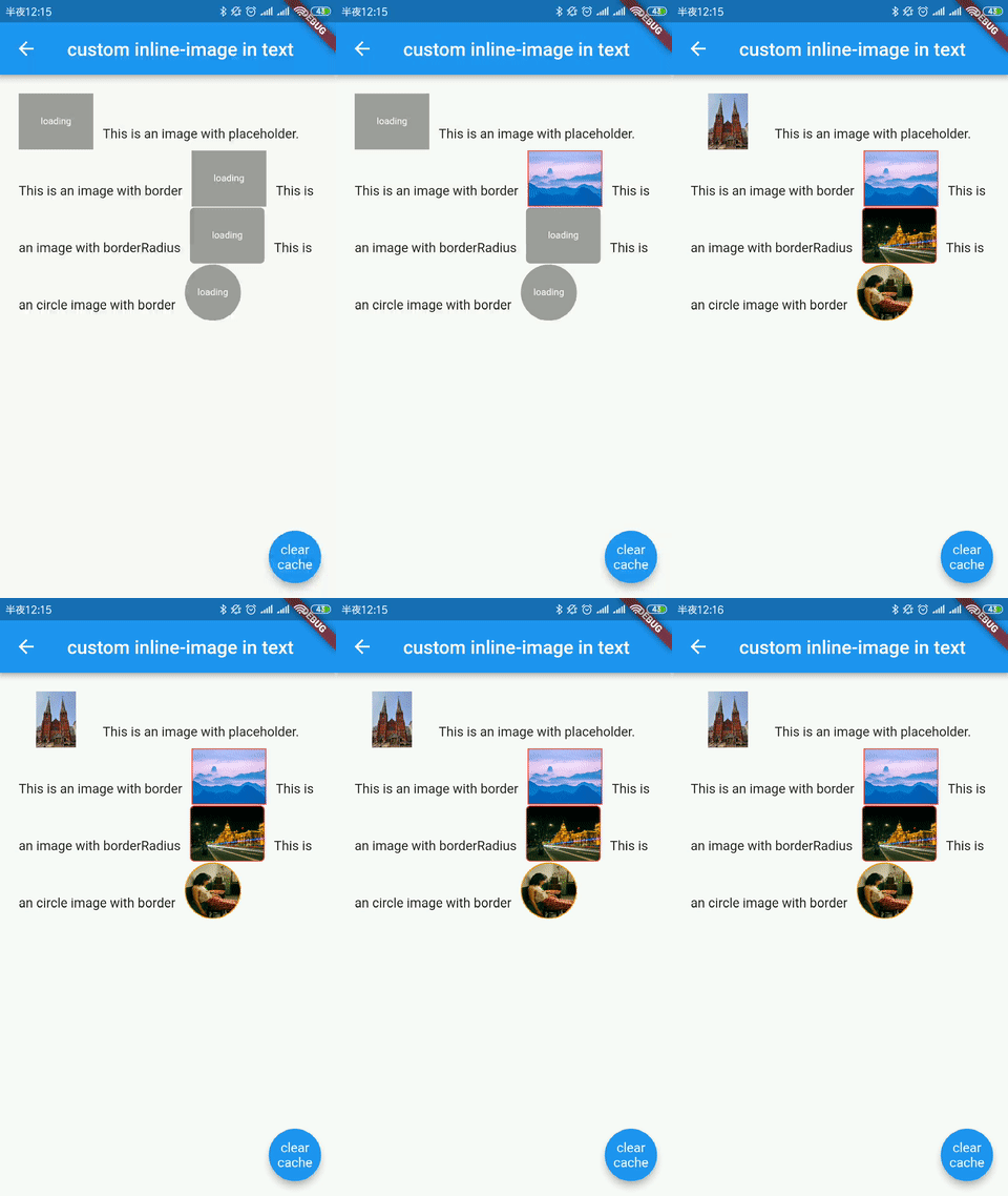
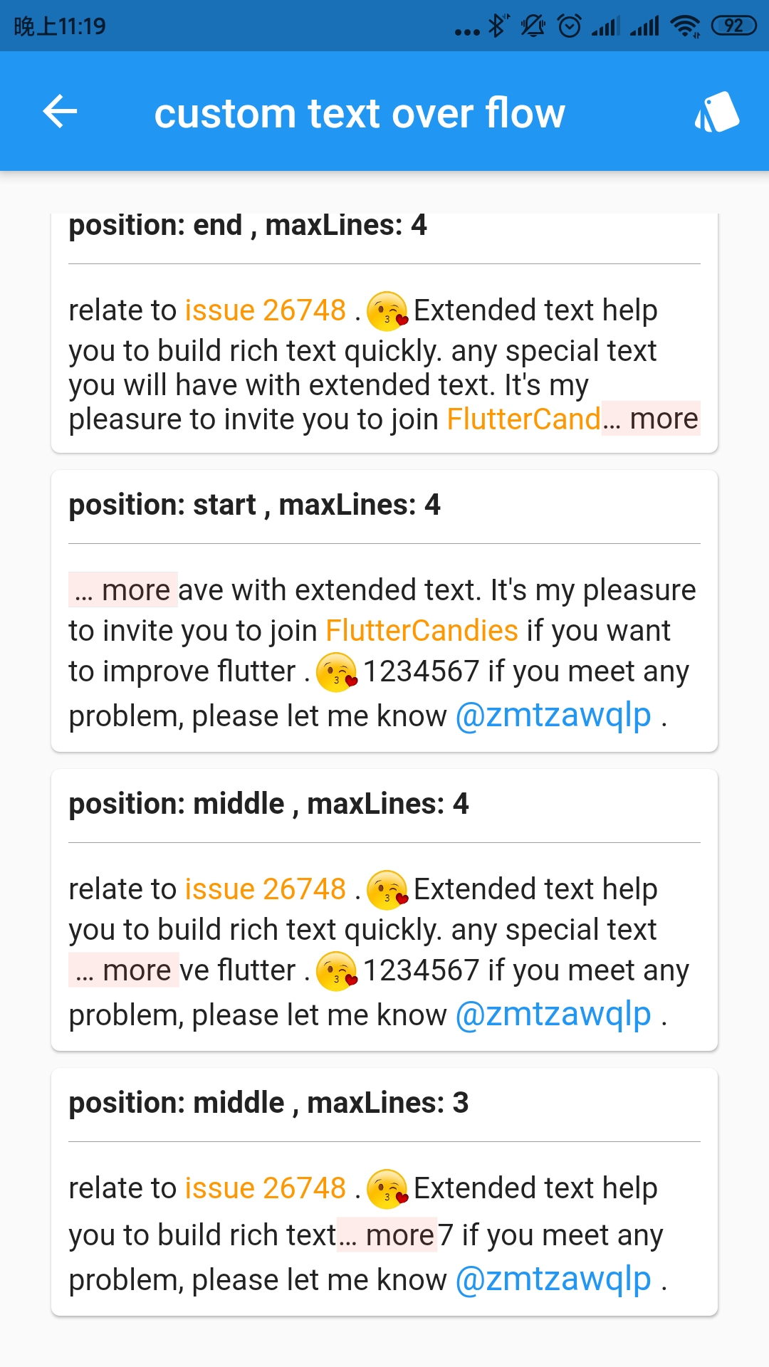
Extended official text to build special text like inline image or @somebody quickly,it also support custom background,custom over flow,gradient and custom selection toolbar and handles.
Package selection guidance compiled from public package information, community data, and project usage.
ExtendedText is a Flutter package that enhances the built-in Text widget by enabling rich text features such as inline images, mentions (@somebody), custom backgrounds, gradient text, and customizable overflow behavior. It supports advanced text editing with a custom selection toolbar and handles, making it ideal for chat interfaces, social media apps, or any app requiring interactive, styled text. The package is actively maintained and compatible across all major platforms.
Use cases
Chat applications
Social media posts
Rich text editors
Interactive tutorials
Content-rich UIs
Key features
Inline image support
Mention handling (@user)
Custom background styling
Gradient text effects
Custom selection toolbar
Overflow customization
Suitable for
Developers building chat apps
Apps needing rich text formatting
UIs with interactive text elements
Cross-platform rich text needs
Advanced text editing requirements
Considerations
Requires understanding of extended text widgets
May increase complexity for simple text displays
Needs careful handling of custom spans
Platform-specific rendering differences
Potential performance impact with heavy content
Original README
Original README snapshot from the linked source repository. Visit the repository for the latest content.
Extended official text to build special text like inline image or @somebody quickly,it also support custom background,custom over flow and custom selection toolbar and handles.
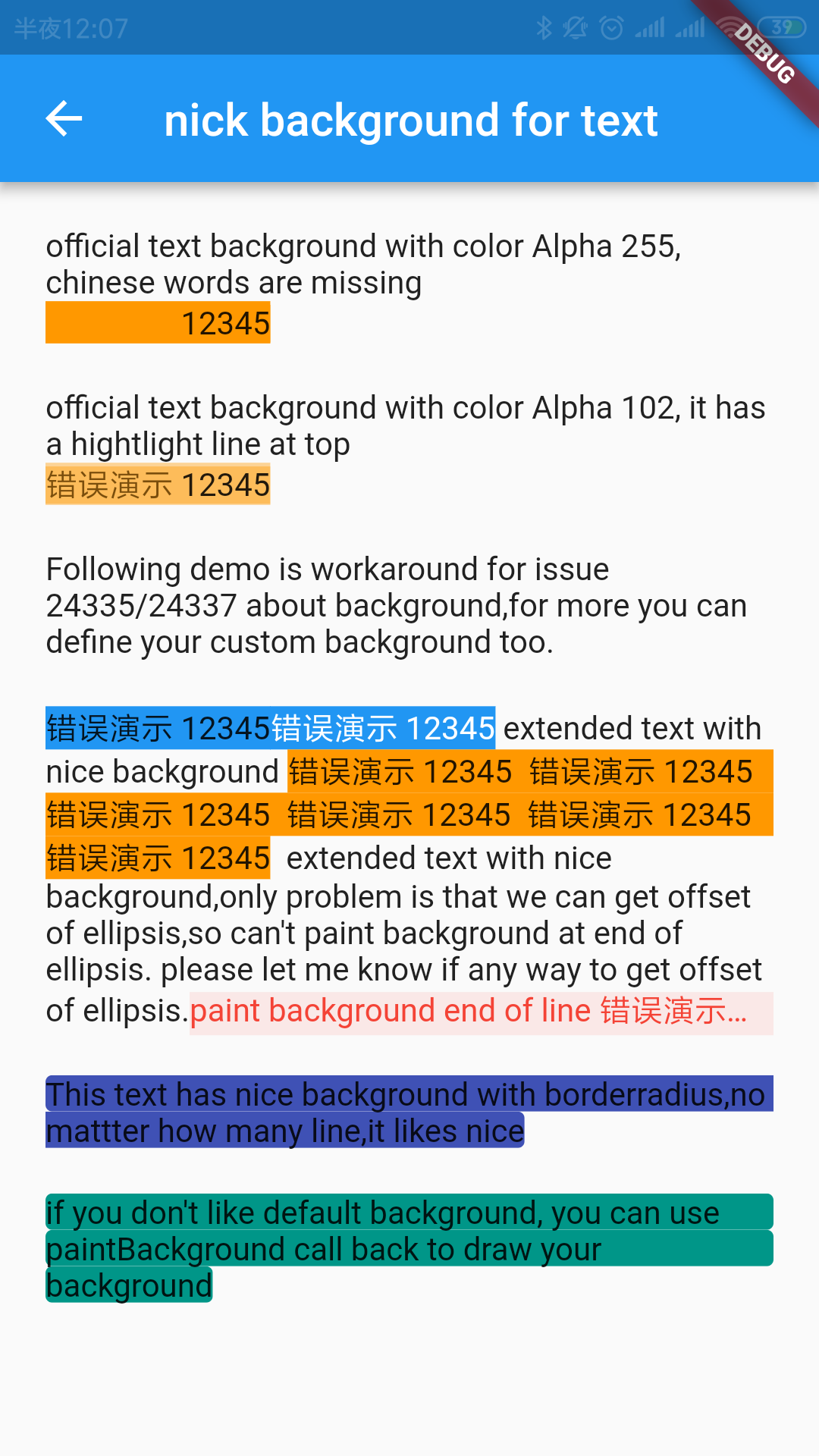
  BackgroundTextSpan(
      text:
          "This text has nice background with borderradius,no mattter how many line,it likes nice",
      background: Paint()..color = Colors.indigo,
      clipBorderRadius: BorderRadius.all(Radius.circular(3.0))),
parameter
description
default
background
Background painter
-
clipBorderRadius
Clip BorderRadius
-
paintBackground
Paint background call back, you can paint background by self
[gradient] is the gradient that will be applied to the text.
[ignoreWidgetSpan] determines whether WidgetSpan elements should be
included in the gradient application. By default, widget spans are ignored.
[renderMode] specifies how the gradient should be applied to the text. The default
is [GradientRenderMode.fullText], meaning the gradient will apply to the entire text.
[ignoreRegex] is a regular expression used to exclude certain parts of the text
from the gradient effect. For example, it can be used to exclude specific characters
or words (like emojis or special symbols) from the gradient application.
[beforeDrawGradient] A callback function that is called before the gradient is drawn on the text.
[blendMode] The blend mode to be used when applying the gradient.
default: [BlendMode.srcIn] (i.e., the gradient will be applied to the text).
It's better to use [BlendMode.srcIn] or [BlendMode.srcATop].