Package selection guidance compiled from public package information, community data, and project usage.
A lightweight Flutter package offering a variety of loading animations implemented entirely in Dart. It provides smooth, customizable loading indicators without requiring external dependencies. Ideal for displaying loading states in apps across multiple platforms, it supports Android, iOS, Web, macOS, Windows, and Linux. The package is easy to integrate and use, making it perfect for enhancing user experience during asynchronous operations.
Use cases
Displaying loading states in forms
Showing progress during data fetching
Enhancing UI during page transitions
Providing visual feedback in background tasks
Creating custom loading screens
Key features
Pure Dart implementation
No additional dependencies
Cross-platform support
Multiple animation styles
Easy to customize
Lightweight size
Suitable for
Simple loading UIs
Apps targeting multiple platforms
Developers avoiding external libraries
UI enhancements in mobile and web apps
Fast integration into existing projects
Considerations
Limited to basic loading animations
No advanced customization options beyond color and size
Animations may not be as performant on low-end devices
Not suitable for complex loading logic
Lacks built-in error or success states
Original README
Original README snapshot from the linked source repository. Visit the repository for the latest content.
LoadingIndicator
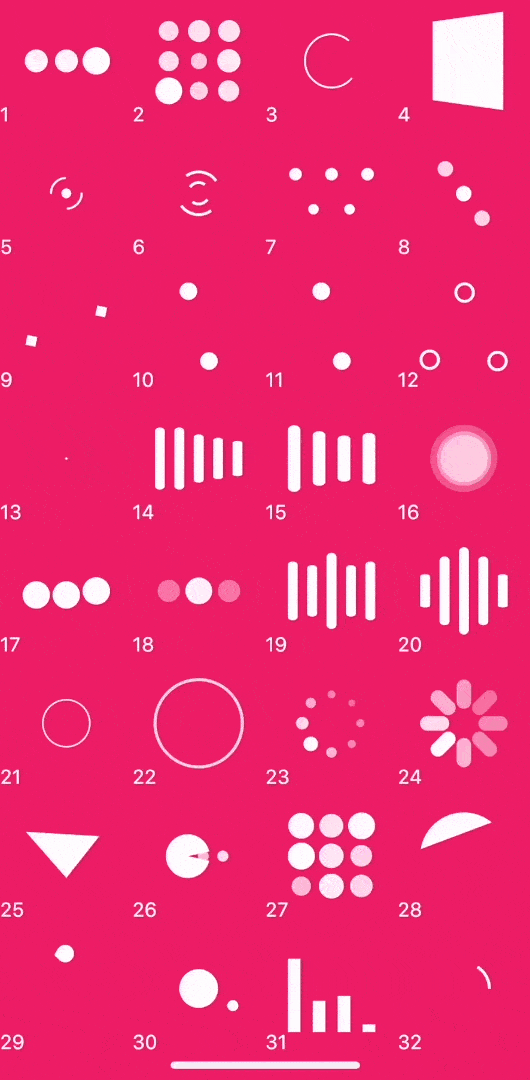
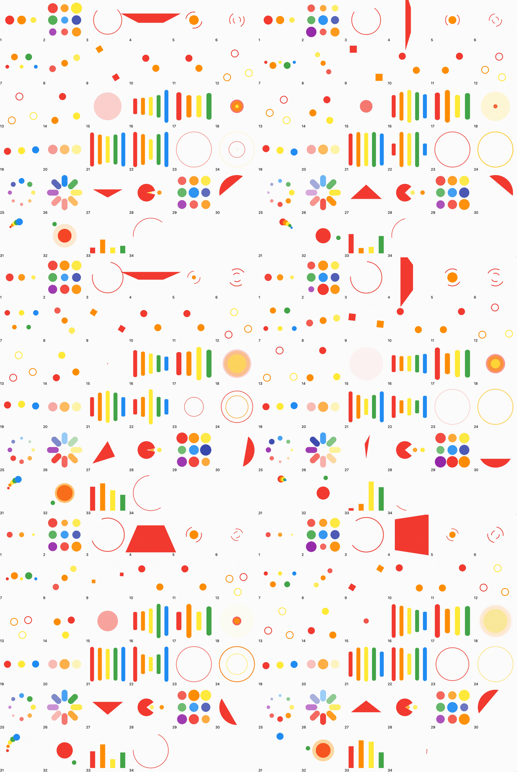
A collection of out of the box loading animations written in pure dart, no extra dependency, inspired by loaders.css and NVActivityIndicatorView.
Demo
Now, you can click this site to preview.3D effect will be invalid in web.
Use the release helper from the latest master checkout to calculate the next
version from the existing stable tags and update the root pubspec.yaml and
CHANGELOG.md:
patch, minor, and major are supported, as well as an explicit version
such as 4.0.2. The helper refreshes tags from origin and ignores local tags
that no longer exist remotely. It accepts a release tag that is either in the
current history or fully represented by cherry-picked commits, and refuses to
continue when the latest tag cannot be matched to the current history. For an
automatic patch, it asks GitHub for notes before changing files and copies the
returned Markdown into the dated changelog entry. A real patch
run (not --dry-run) requires a clean master matching origin/master,
updates only the root pubspec.yaml and CHANGELOG.md, commits them, pushes
master, creates and pushes the next version tag, and invokes gh release create with
the generated notes. It does not modify
example/pubspec.yaml. gh must be installed and authenticated. The existing
tag-triggered workflow safely skips release creation when the script has
already created it. minor, major, and explicit versions update the local
root pubspec.yaml and CHANGELOG.md with a placeholder, then print the
release-notes command.
Usage
Simple but powerful parameters
LoadingIndicator(
  indicatorType: Indicator.ballPulse, // Required: animation type
  colors: const [Colors.white],        // Optional: color collection
  strokeWidth: 2,                      // Optional: stroke and line width
  backgroundColor: Colors.black,       // Optional: widget background
  pathBackgroundColor: Colors.black,   // Optional: stroke background
)
strokeWidth controls the bar width of lineScale, lineScaleParty,
lineScalePulseOut, lineScalePulseOutRapid, and lineSpinFadeLoader.
When omitted, these indicators keep their original size-derived bar width.
Without a controller, every indicator plays continuously. To control playback,
create and dispose a LoadingIndicatorController with your widget:
_controller.pause(); // Freeze the current frame immediately.await _controller.pauseAt(0.5); // Pause the next time progress reaches 50%.await _controller.pauseAt(
1.0,
behavior: LoadingIndicatorPauseBehavior.jumpToTarget,
); // Advance the complete animation group to the target and pause now.
_controller.resume();
progress is the normalized position (0.0 to 1.0) of an indicator's
reference animation track: 0.0 is the start of a loop and 1.0 is its final
frame before reset. pauseAt completes only after the indicator has paused.
Replacing a pending command or disposing the controller completes that Future
with LoadingIndicatorCommandCanceled. One controller can be attached to only
one LoadingIndicator at a time; the last command sent while detached is
applied on the next attachment.
Migrating from 3.x
Version 4.0 removes the pause widget parameter. Replace it with a controller:
Copyright 2019 Tino Guo.

Licensed under the Apache License, Version 2.0 (the "License");
you may not use this file except in compliance with the License.
You may obtain a copy of the License at

   http://www.apache.org/licenses/LICENSE-2.0

Unless required by applicable law or agreed to in writing, software
distributed under the License is distributed on an "AS IS" BASIS,
WITHOUT WARRANTIES OR CONDITIONS OF ANY KIND, either express or implied.
See the License for the specific language governing permissions and
limitations under the License.