Package selection guidance compiled from public package information, community data, and project usage.
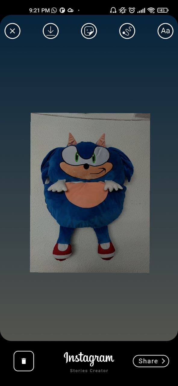
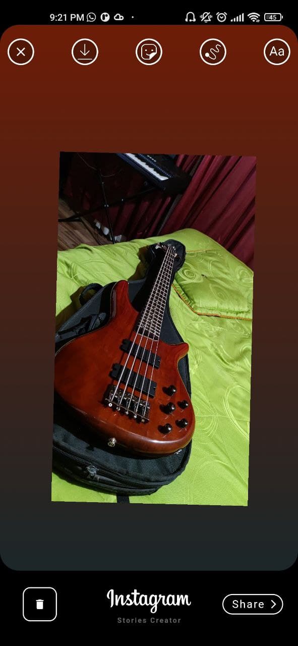
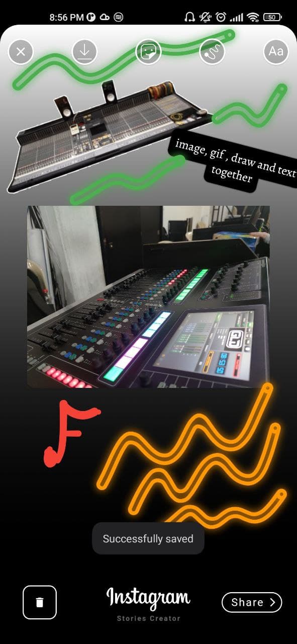
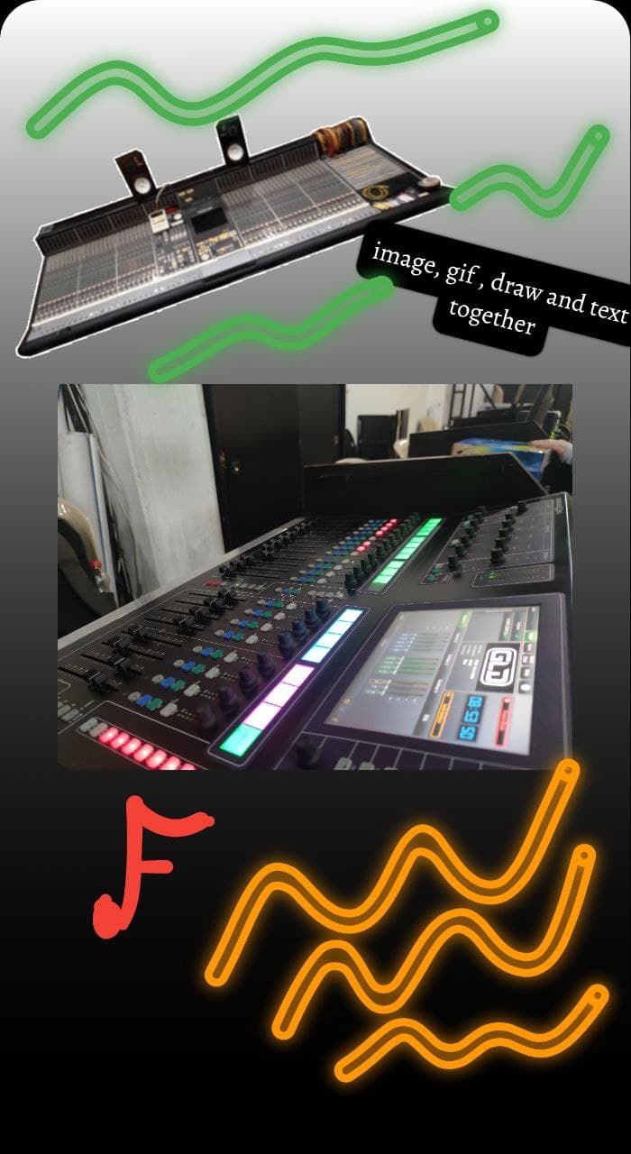
vs_story_designer is a Flutter package that enables users to create Instagram-style stories with interactive elements like images, text overlays, and hand-drawn sketches. Built for Android and iOS, it provides a simple interface for composing visually rich content directly within apps. The package supports editing, saving, and compressing multimedia outputs, making it ideal for social media integration. It's designed with a focus on ease of use and real-time creativity.
Use cases
Creating social media stories
Designing custom image overlays
Adding handwritten annotations
Integrating story creation into apps
Sharing user-generated content
Building creative tools for mobile apps
Key features
Image and text layering
Real-time finger drawing
Multi-platform support (Android & iOS)
Easy export and compression
Simple API for integration
Interactive story composition
Suitable for
Social media app developers
Creative tool builders
Mobile app designers
Content creators
Educational app makers
User-facing design interfaces
Considerations
Requires permission for image access
Limited to basic drawing tools
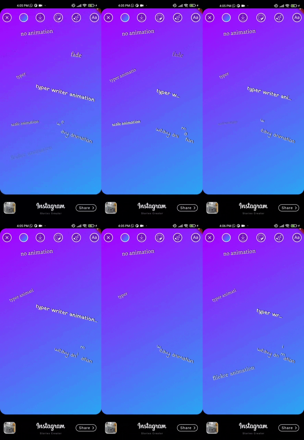
No advanced animation support
Depends on external dependencies
May need customization for complex layouts
Best suited for simple to moderately complex designs
Original README
Original README snapshot from the linked source repository. Visit the repository for the latest content.
vs_story_designer 2.2.1
flutter story designer
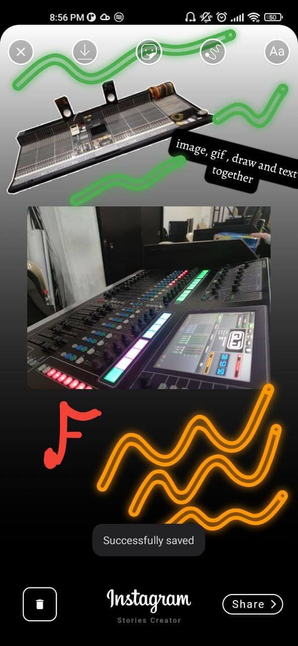
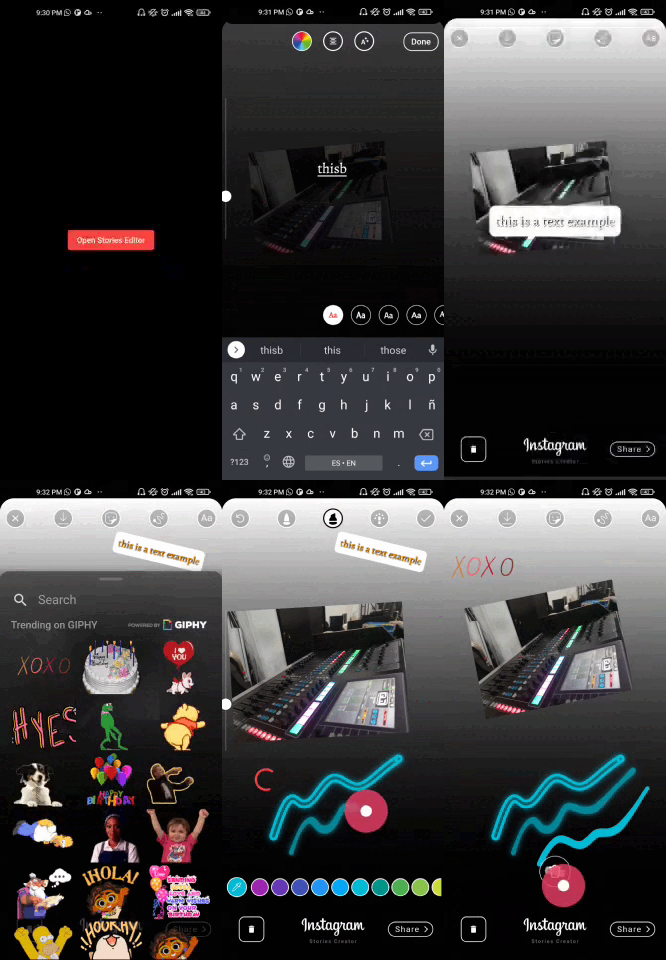
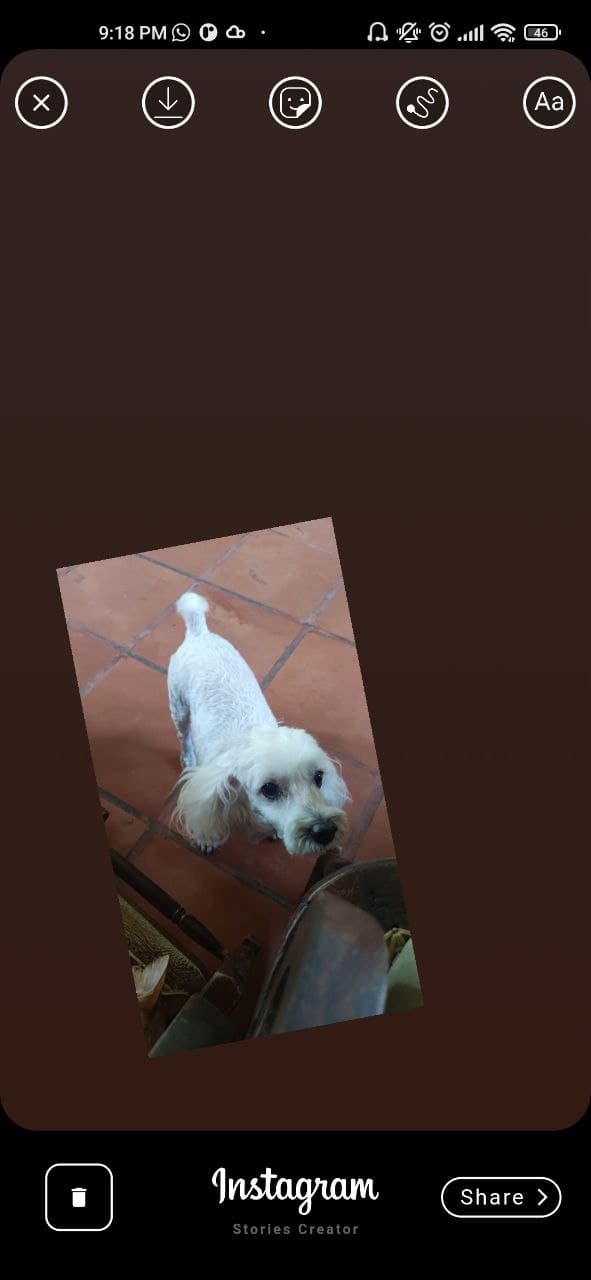
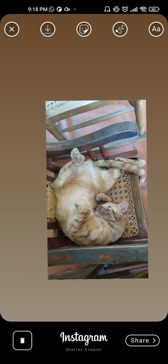
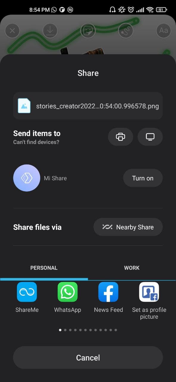
This is a package created in the style of the instagram story creator, with which you can create images with images, texts, finger drawing. They can be exported as an image to the gallery or shared directly to social networks.
Features
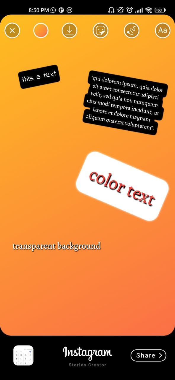
[✔️] Draggable image
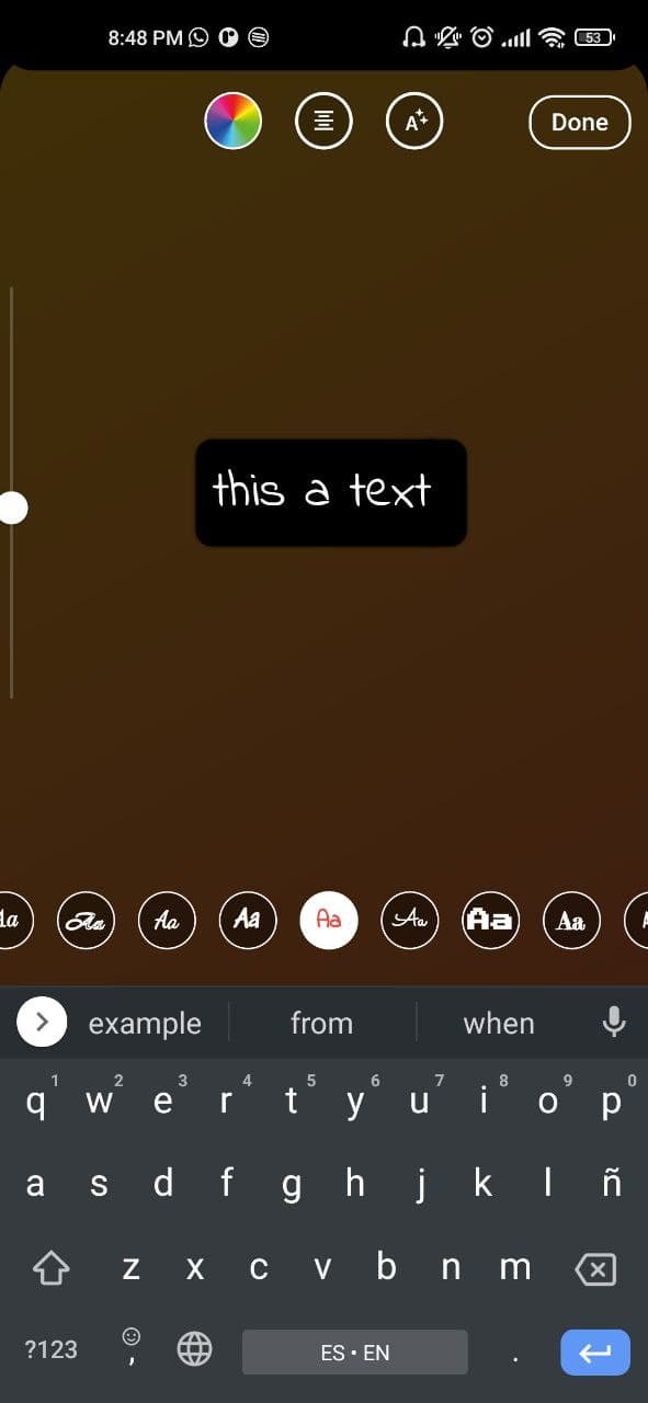
[✔️] Draggable text
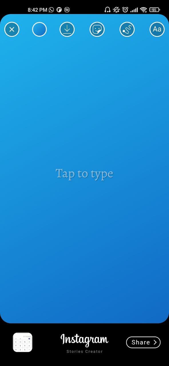
[✔️] Gradient container background
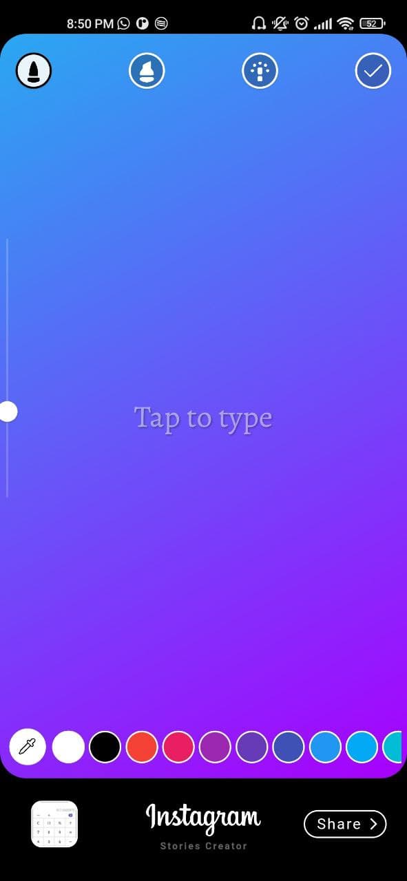
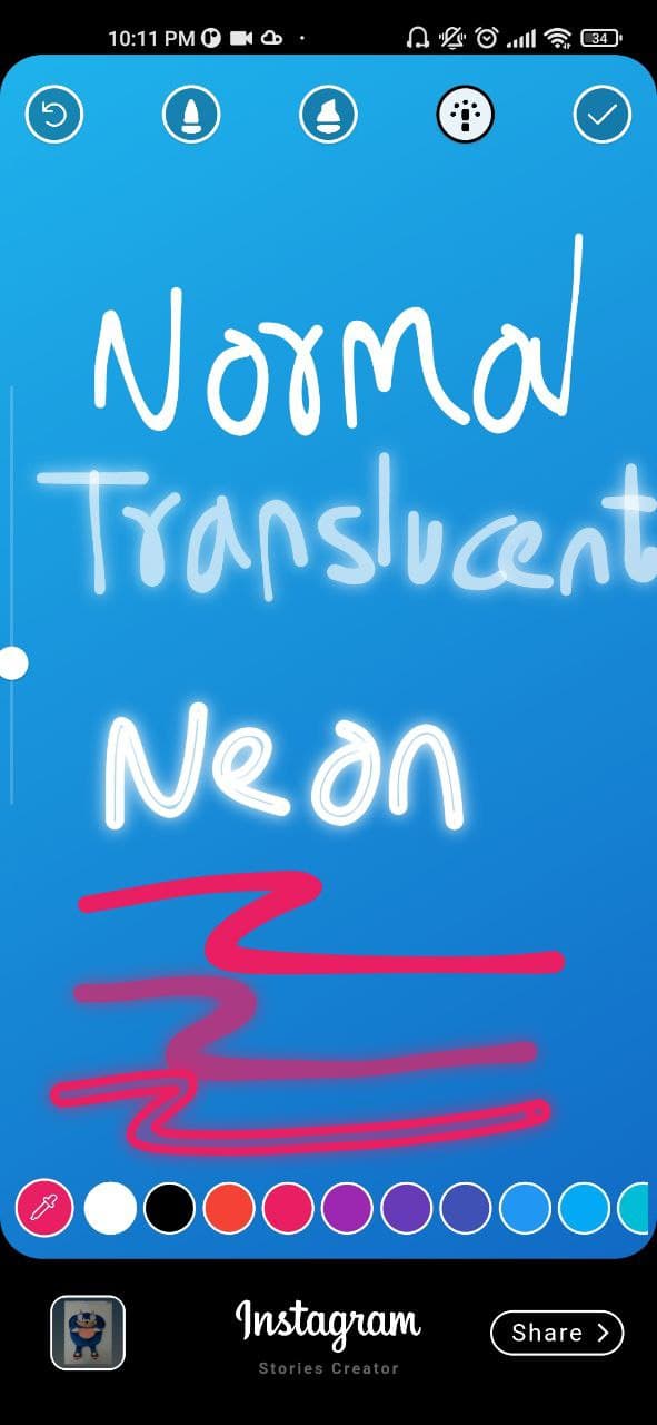
[✔️] Finger painting (normal/translucent/neon)
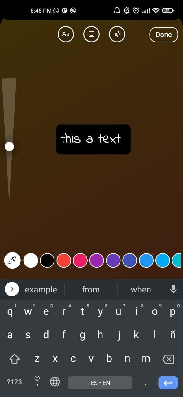
[✔️] Custom colors, gradients and Google font families
<uses-permissionandroid:name="android.permission.READ_EXTERNAL_STORAGE" /><uses-permissionandroid:name="android.permission.WRITE_EXTERNAL_STORAGE"android:maxSdkVersion="31" /><uses-permissionandroid:name="android.permission.INTERNET" /><uses-permissionandroid:name="android.permission.VIBRATE"/><!-- Permission is required if you are targeting android 33 and above --><uses-permissionandroid:name="android.permission.READ_MEDIA_IMAGES"/><uses-permissionandroid:name="android.permission.READ_MEDIA_VIDEO"/><uses-permissionandroid:name="android.permission.READ_MEDIA_AUDIO"/>
Create a VSStoryDesigner() widget with the follow params:
VSStoryDesigner(
giphyKey: '[YOUR GIPHY API KEY]', /// (String), //disabled feature for now
onDone: (String uri){
/// uri is the local path of final render Uint8List/// here your code
},
mediaPath: mediaPath // OPTIONAL, pass path of media, image to use inside the package by default.
themeType: ThemeType.dark, // OPTIONAL, DEFAULT ThemeType.dark
centerText : "Start Designing"//mandatory param, this text will appear in center of story designer
colorList: [] /// (List<Color>[]) optional param
gradientColors: [] /// (List<List<Color>>[]) optional param
middleBottomWidget: Container() /// (Widget) optional param, you can add your own logo or text in the bottom tool
fontFamilyList: [] /// (List<FontType>) optional param
isCustomFontList: ''/// (bool) if you use a own font list set value to "true"
onDoneButtonStyle: Container() /// (Widget) optional param, you can create your own button style
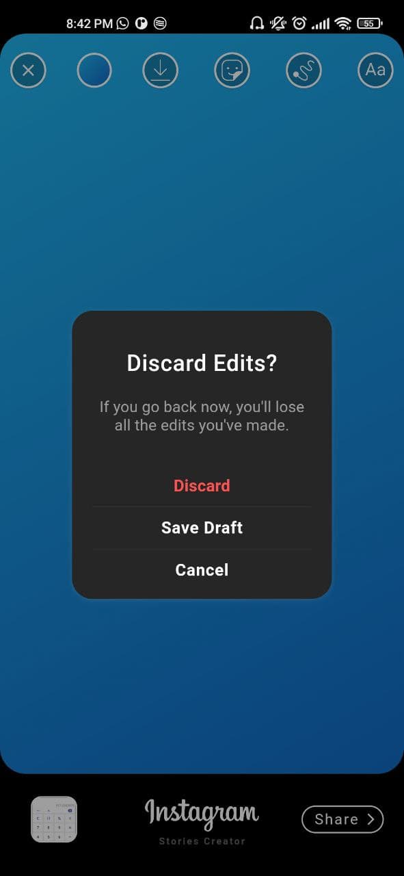
onBackPress: /// (Future<bool>) optional param, here you can add yor own style dialog
editorBackgroundColor: /// (Color) optional param, you can define your own background editor color
galleryThumbnailQuality: /// (int = 200) optional param, you can set the gallery thumbnail quality (higher is better but reduce the performance)
);