Original README snapshot from the linked source repository. Visit the repository for the latest content.
dots_indicator
Widget to display dots indicator to show a position (for a PageView for example).
Installation
You just need to add dots_indicator as a dependency in your pubspec.yaml file.
dependencies:
  dots_indicator: ^5.0.0
Breaking change in 5.0.0: this package now uses the standalone
material_ui package instead of
package:flutter/material.dart. Your app must also use material_ui (or
keep the deprecated MaterialUiCompatibilityBridge), otherwise tapping a
dot (onTap) throws No Material widget found. Requires Flutter
>=3.44.0 and Dart ^3.12.0. See the CHANGELOG for
details.
Quick start
The typical use case is to pair DotsIndicator with a PageView, syncing
position to the controller's current page:
class MyPageView extends StatefulWidget {
  const MyPageView({super.key});

  @override
  State<MyPageView> createState() => _MyPageViewState();
}

class _MyPageViewState extends State<MyPageView> {
  final _pages = const [Page1(), Page2(), Page3()];
  final _pageController = PageController();
  double _currentPage = 0;

  @override
  void initState() {
    super.initState();
    _pageController.addListener(() {
      setState(() => _currentPage = _pageController.page ?? 0);
    });
  }

  @override
  void dispose() {
    _pageController.dispose();
    super.dispose();
  }

  @override
  Widget build(BuildContext context) {
    return Column(
      children: [
        Expanded(
          child: PageView(controller: _pageController, children: _pages),
        ),
        DotsIndicator(
          dotsCount: _pages.length,
          position: _currentPage,
        ),
      ],
    );
  }
}
You can also drive DotsIndicator manually (no PageView), or let it drive
navigation itself with onTap — see below.
Example
In these examples, pageLength is the total of dots to display and currentPage is the position to highlight (the active dot).
For information, currentPage is a double, to be able to have lerp animation.
A simple dots indicator

DotsIndicator(
  dotsCount: pageLength,
  position: currentPage,
);
Custom colors

DotsIndicator(
dotsCount: pageLength,
position: currentPage,
decorator: DotsDecorator(
color: Colors.black87,
activeColor: Colors.redAccent,
),
);
Use specific color for each dot
You can choose to have one color for inactive dots and one color the active dot.
But you can also define one color by inactive dots (colors) and one color by active dot (activeColors).
If you have a total of 3 dots, you must provide an array of 3 colors.
DotsIndicator(
dotsCount: pageLength,
position: currentPage,
decorator: DotsDecorator(
colors: [Colors.grey[300], Colors.grey[600], Colors.grey[900]],
activeColors: [Colors.red[300], Colors.red[600], Colors.red[900]],
),
);
Custom size and shape
You can change the default size of dots and also shape.
So you can choose to have a shape for inactive dots and another shape for the active dot for example.
By default, the shape of dots are CircleBorder, so to have a rounded rectangle for active one, you need to change activeShape
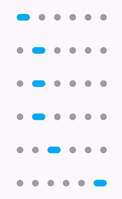
DotsIndicator(
  dotsCount: pageLength,
  position: currentPage,
  decorator: DotsDecorator(
    size: const Size.square(9.0),
    activeSize: const Size(18.0, 9.0),
    activeShape: RoundedRectangleBorder(borderRadius: BorderRadius.circular(5.0)),
  ),
);
Custom size for each dot
You can customize the size of each dot, for inactive and/or active dots.
For that, use sizes and/or activeSizes params.
DotsIndicator(
  dotsCount: pageLength,
  position: currentPage,
  decorator: DotsDecorator(
    sizes: [
      const Size.square(10.0),
      const Size.square(15.0),
      const Size.square(20.0),
    ],
    activeSizes: [
      const Size.square(25.0),
      const Size.square(25.0),
      const Size.square(35.0),
    ],
  ),
);
Custom shape
You can change the default shape of dots. By default it's a CircleBorder.
You can change the no active and active dot shape.

DotsIndicator(
  dotsCount: pageLength,
  position: currentPage,
  decorator: DotsDecorator(
    shape: const Border(),
    activeShape: RoundedRectangleBorder(borderRadius: BorderRadius.circular(5.0)),
  ),
);
Custom shape for each dot
You can customize the shape of each dot, for inactive and/or active dots.
For that, use shapes and/or activeShapes params.
DotsIndicator(
  dotsCount: pageLength,
  position: currentPage,
  decorator: DotsDecorator(
    shapes: [
      RoundedRectangleBorder(borderRadius: BorderRadius.circular(5.0)),
      RoundedRectangleBorder(borderRadius: BorderRadius.circular(10.0)),
      RoundedRectangleBorder(borderRadius: BorderRadius.circular(15.0)),
    ],
    activeShapes: [
      RoundedRectangleBorder(borderRadius: BorderRadius.circular(10.0)),
      RoundedRectangleBorder(borderRadius: BorderRadius.circular(10.0)),
      RoundedRectangleBorder(borderRadius: BorderRadius.circular(25.0)),
    ],
  ),
);
Change the space between dots
By default a dot have a margin of 6 pixels on his left and right. It's EdgeInsets.symmetric(horizontal: 6.0).
But if you want you can change it, for example to increase the space between dots or to add top margin.

DotsIndicator(
  dotsCount: pageLength,
  position: currentPage,
  decorator: DotsDecorator(
    spacing: const EdgeInsets.all(10.0),
  ),
);
Axis and reverse property
There is two other property, axis and reversed.
Axis is to display dots indicator horizontally (default) or vertically.
Also, you can set reversed: true to reverse the order of dots. (default: false).
For example, if you want to display the dots indicator vertically, but with the first dots on bottom :
Set axis: Axis.vertical and reversed: true.
Obviously, you can use reversed with Axis.horizontal.
DotsIndicator(
  dotsCount: pageLength,
  position: currentPage,
  axis: Axis.vertical,
  reversed: true,
);
onTap property
Add the onTap property to let users jump directly to a page by tapping its
dot, instead of only reflecting the current page.
DotsIndicator(
  dotsCount: pageLength,
  position: currentPage,
  onTap: (index) {
    _pageController.animateToPage(
      index,
      duration: const Duration(milliseconds: 300),
      curve: Curves.ease,
    );
  },
);
Fade out the last dot (indefinite pager)
When dotsCount is large (or unknown), showing every dot isn't practical.
Set fadeOutLastDot: true with a fadeOutDistance to only keep a window of
dots fully visible around the current position, fading the rest out — and
animate: true to transition smoothly as position changes.
DotsIndicator(
  dotsCount: pageLength,
  position: currentPage,
  fadeOutLastDot: true,
  fadeOutDistance: 2,
  animate: true,
);

