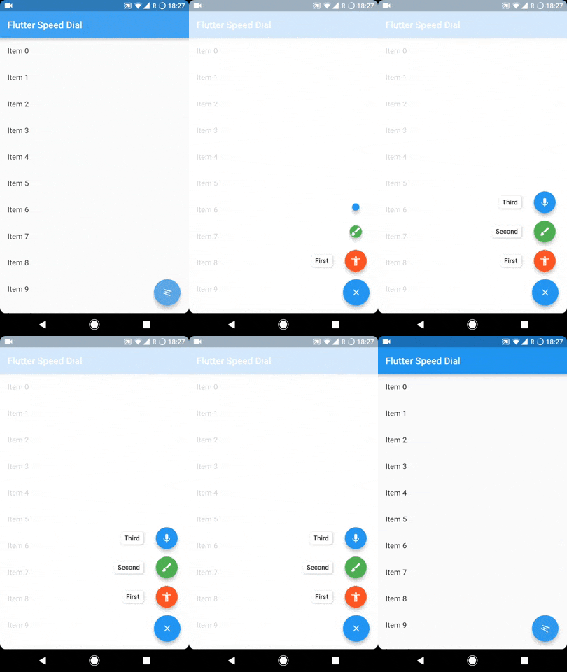
Package selection guidance compiled from public package information, community data, and project usage.
A Flutter plugin that implements a dynamic and visually appealing Material Design Speed Dial. It supports animated icons, labels, multi-directional child positioning, and smooth transitions. Ideal for enhancing navigation in apps with limited space, it provides an intuitive way to access multiple actions from a single floating button. The plugin is compatible across all major platforms including Android, iOS, Web, macOS, Windows, and Linux.
Use cases
Enhancing mobile app navigation
Providing quick access to multiple actions
Improving UI efficiency in compact layouts
Adding interactive elements in dashboards
Creating modern, gesture-friendly interfaces
Key features
Animated icon transitions
Label support for child actions
Multi-directional child placement
Customizable speed dial behavior
Cross-platform compatibility
Smooth open/close animations
Suitable for
Mobile app developers
UI/UX designers seeking Material Design components
Apps requiring compact action menus
Developers targeting multiple platforms
Projects using Material Design guidelines
Considerations
May impact performance with many children
Requires careful layout planning
Limited customization beyond built-in options
Not ideal for complex nested interactions
Best suited for simple, focused action sets
Original README
Original README snapshot from the linked source repository. Visit the repository for the latest content.
To sustain the development of this library we need someone who can help this library either through code or by donating it. Donation will help us to live up in the world of unmaintained open source packages and to dedicate more time in improving this to live up to the mark. We will also add the name of the contributors or the donaters in the README section.
To donate directly you can use below link, don't forget to leave a message there:
Or become a Github sponser by clicking on the Sponser button in this repository.
Usage
The SpeedDial widget is built to be placed in the Scaffold.floatingActionButton argument, replacing the FloatingActionButton widget.
You can set its position using Scaffold.floatingActionButtonLocation argument.
It can also be used with Scaffold.bottomNavigationBar and Snackbar.
Null safety is available from version 3.0.5( It is also backward compatible, meaning you can use it with non null safe code too )
Labels
SpeedDial can take any Widget as labelSpeedDial will use Extended FloatingActionButton property if label is specified. It also have activeLabel property by which you can specify the label which is shown when SpeedDial is open. It also comes with its labelTransitionBuilder which defaults to fade transition.
Also Every child's button have label property which accepts String which can be styled by using labelStyle. If you want to specify a widget then you can use labelWidget.
If the label parameter is not provided, then the label will be not rendered.
Types of child for SpeedDial (Ordered by their priority)
Animated Icon using animatedIcon property
SpeedDial's AnimatedIcon has two specific parameters:
animatedIcon takes an AnimatedIconData widget
animatedIconTheme takes IconThemeData
Widget using child & activeChild property
SpeedDial's Widget has two specific parameters:
child takes a widget and is the default placeholder if dial is not open.
activeChild takes a widget and is the child's Widget which is used when dial is open, not required.
IconData using icon & activeIcon property
SpeedDial's IconData has three specific parameters:
icon takes a IconData and is the default placeholder if dial is not open.
activeIcon takes a IconData and is the child's IconData which is used when dial is open, not required.
iconTheme takes its IconThemeData which includes color and size.
The package will handle the animation by itself.
Handle spacing
There are various properties for SpeedDial by which you can adjust the spacing:
spacing - This parameter handles the space b/w speed dial and its children.
spaceBetweenChildren - As the name suggests, this is used to adjust the space b/w every child element
childPadding - This will adjust the padding of children speed dial button, this will help you to control the size of the children button more effectively.
childMargin - This will help you to adjust the margin b/w children speed dial button and its label.
Close on WillPop
Closes automatically on back button press, if dial is open.
If you don't want this behaviour then simply change the value of closeDialOnPop to false.