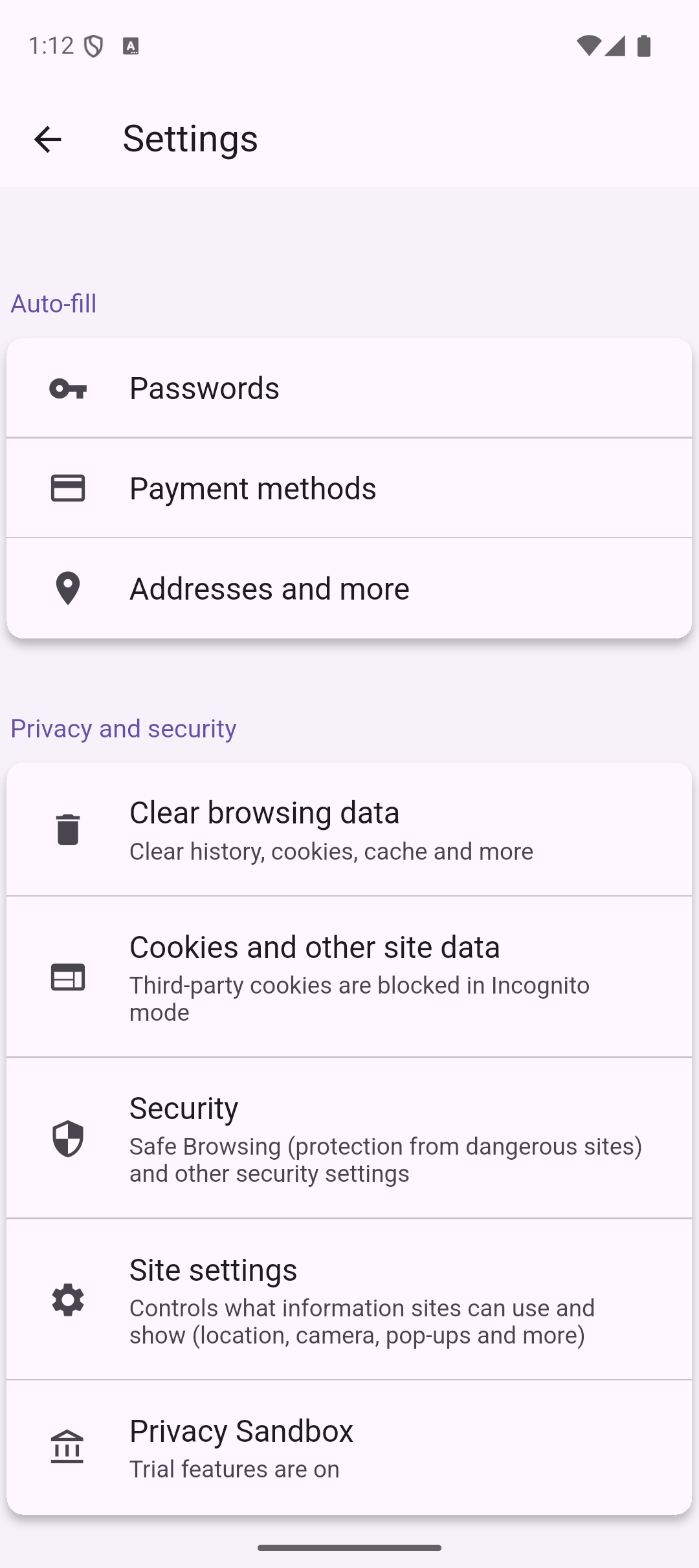
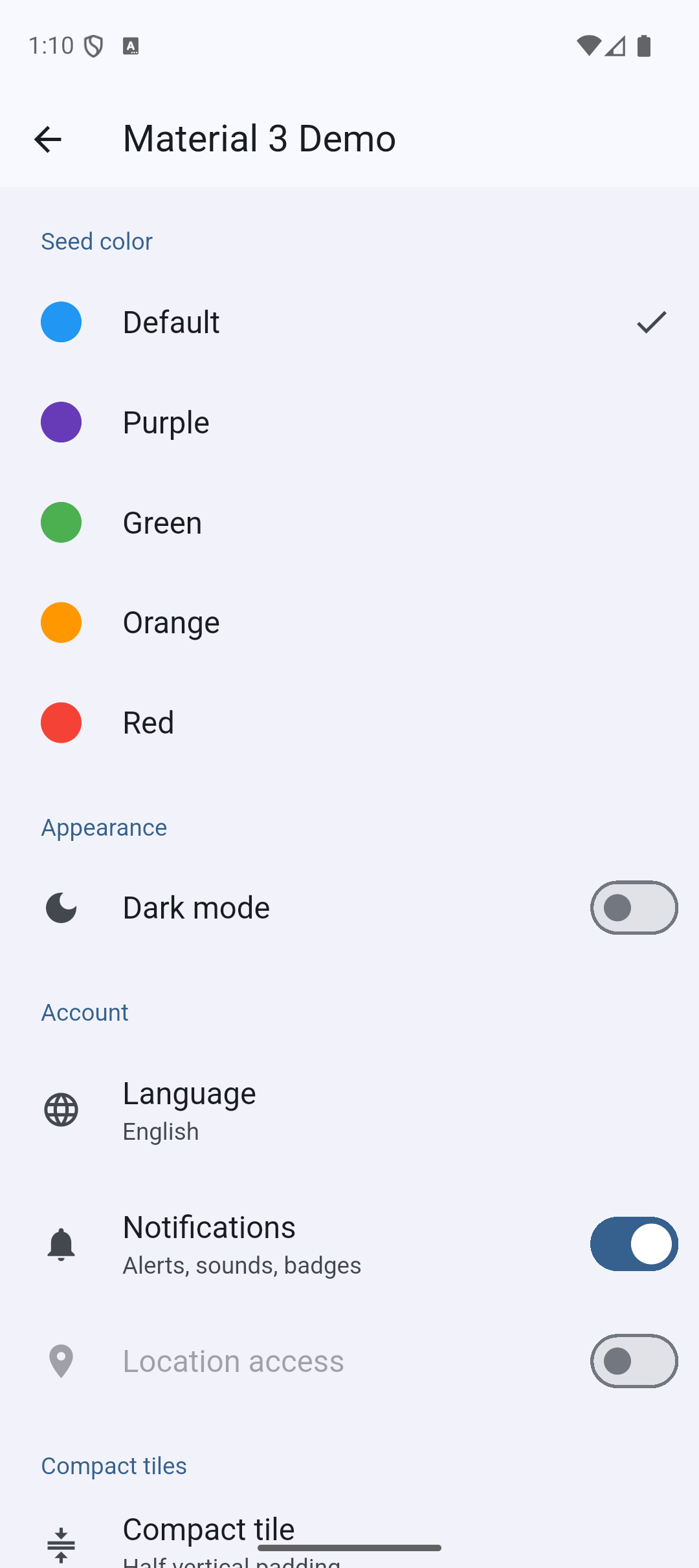
Original README snapshot from the linked source repository. Visit the repository for the latest content.
Settings UI for Flutter
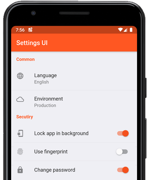
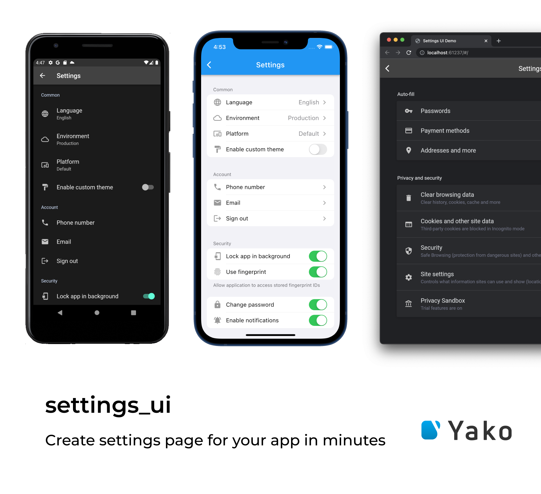
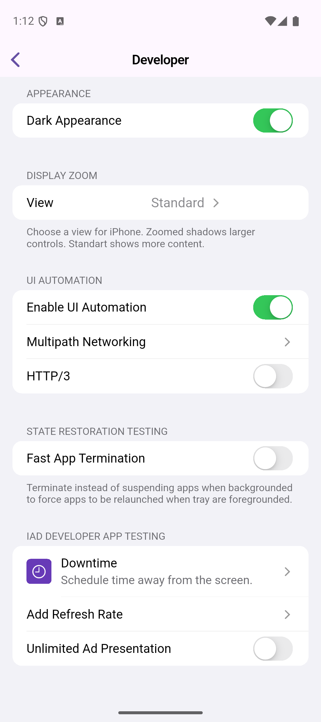
A Flutter package for building settings screens that look native on Android , iOS , and Web — all from a single API. The UI automatically adapts to each platform's visual style: Material for Android, Cupertino for iOS, and a card-based Web layout. Also runs on macOS, Windows, Linux, and Fuchsia (macOS/Windows use the Cupertino style; Linux uses Material).
Contents
Installing
Add to your pubspec.yaml:
dependencies:
  settings_ui: ^3.0.1
Then import:
import 'package:settings_ui/settings_ui.dart' ;
Quick start
class SettingsScreen extends StatefulWidget const SettingsScreen ({super .key});
@override
State <SettingsScreen > createState () => _SettingsScreenState ();
}
class _SettingsScreenState extends State <SettingsScreen > bool _notificationsEnabled = true ;
bool _darkMode = false ;
@override
Widget build (BuildContext context) {
return Scaffold (
appBar: AppBar (title: const Text ('Settings' )),
body: SettingsList (
sections: [
SettingsSection (
title: const Text ('General' ),
tiles: [
SettingsTile .navigation (
leading: const Icon (Icons .language),
title: const Text ('Language' ),
value: const Text ('English' ),
onPressed: (context) { },
),
],
),
SettingsSection (
title: const Text ('Appearance' ),
tiles: [
SettingsTile .switchTile (
leading: const Icon (Icons .dark_mode),
title: const Text ('Dark mode' ),
initialValue: _darkMode,
onToggle: (value) => setState (() => _darkMode = value),
),
SettingsTile .switchTile (
leading: const Icon (Icons .notifications),
title: const Text ('Notifications' ),
description: const Text ('Alerts, sounds, badges' ),
initialValue: _notificationsEnabled,
onToggle: (value) =>
setState (() => _notificationsEnabled = value),
),
],
),
],
),
);
}
}
Tile types
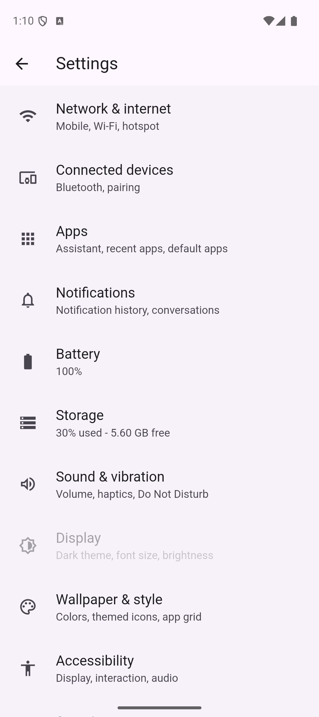
SettingsTile — basic tileA tappable tile with optional leading icon, description, and trailing widget.
SettingsTile (
leading: const Icon (Icons .storage),
title: const Text ('Storage' ),
description: const Text ('30% used — 5.60 GB free' ),
onPressed: (context) { },
)
SettingsTile.navigation — navigation tileAdds a platform-appropriate trailing chevron. Right arrow in LTR, left arrow in RTL.
SettingsTile .navigation (
leading: const Icon (Icons .language),
title: const Text ('Language' ),
value: const Text ('English' ),
titleDescription: const Text ('Choose your preferred language' ),
onPressed: (context) {
Navigator .of (context).push ();
},
)
SettingsTile.switchTile — switch tileRenders a Switch on Material platforms and a CupertinoSwitch on iOS/macOS.
SettingsTile .switchTile (
leading: const Icon (Icons .fingerprint),
title: const Text ('Use biometrics' ),
description: const Text ('Unlock with fingerprint or Face ID' ),
initialValue: _biometricsEnabled,
onToggle: (value) => setState (() => _biometricsEnabled = value),
)
CustomSettingsTile — any widget as a tileCustomSettingsTile (
child: Padding (
padding: const EdgeInsets .symmetric (horizontal: 16 , vertical: 12 ),
child: LinearProgressIndicator (value: 0.3 ),
),
)
CustomSettingsSection — any widget as a sectionCustomSettingsSection (
child: Padding (
padding: const EdgeInsets .all (16 ),
child: Text (
'Signed in as Danny Yako' ,
style: Theme .of (context).textTheme.bodySmall,
),
),
)
Platform styles
SettingsList detects the platform automatically. You can override it:
SettingsList (
platform: DevicePlatform .iOS,
sections: [ ],
)
Android (Material) • iOS (Cupertino) • Web
DevicePlatformStyle
device (default) Auto-detected at runtime
android, fuchsia, linuxMaterial
iOS, macOS, windowsCupertino
webWeb (card layout)
Theming
Material 3 (v3.0.0+)
On Android and Web, colors are automatically derived from your app's ColorScheme. No extra configuration needed — seed colors, light/dark mode, and custom ColorScheme all work out of the box.
MaterialApp (
theme: ThemeData (
colorSchemeSeed: Colors .indigo,
useMaterial3: true ,
),
home: const SettingsScreen (),
)
Custom theme overrides
Any field left null falls back to the platform default derived from your ColorScheme.
SettingsList (
lightTheme: const SettingsThemeData (
settingsListBackground: Color (0xFFF2F2F7 ),
settingsSectionBackground: Colors .white,
titleTextColor: Colors .indigo,
),
darkTheme: const SettingsThemeData (
settingsListBackground: Color (0xFF1C1C1E ),
settingsSectionBackground: Color (0xFF2C2C2E ),
titleTextColor: Colors .indigoAccent,
),
sections: [ ],
)
Custom text styles
SettingsList (
lightTheme: SettingsThemeData (
tileTextStyle: const TextStyle (fontFamily: 'Roboto' , fontSize: 16 ),
tileDescriptionTextStyle: const TextStyle (fontSize: 12 ),
titleTextStyle: const TextStyle (
fontWeight: FontWeight .bold,
fontSize: 13 ,
letterSpacing: 0.5 ,
),
),
sections: [ ],
)
Disabled tiles
SettingsTile .switchTile (
title: const Text ('Feature' ),
initialValue: false ,
onToggle: null ,
enabled: false ,
)
SettingsList (
lightTheme: const SettingsThemeData (
inactiveSwitchColor: Colors .grey,
),
sections: [ ],
)
Advanced usage
Scroll controller
final _controller = ScrollController ();
SettingsList (
scrollController: _controller,
sections: [
SettingsSection (
tiles: [
SettingsTile (
title: const Text ('Jump to bottom' ),
onPressed: (_) => _controller.animateTo (
_controller.position.maxScrollExtent,
duration: const Duration (milliseconds: 300 ),
curve: Curves .easeOut,
),
),
],
),
],
)
Compact tiles
SettingsTile (
title: const Text ('Option' ),
compact: true ,
)
Embedding inside another scroll view
SettingsList (
shrinkWrap: true ,
physics: const NeverScrollableScrollPhysics (),
sections: [ ],
)
Wide screen alignment
On screens wider than 810 dp, the list auto-centers. To left-align:
SettingsList (
crossAxisAlignment: CrossAxisAlignment .start,
sections: [ ],
)
CupertinoApp support
SettingsList (
applicationType: ApplicationType .cupertino,
sections: [ ],
)
SettingsList (
applicationType: ApplicationType .both,
sections: [ ],
)
API reference
SettingsList
Parameter
Type
Default
Description
sectionsList<AbstractSettingsSection>required
Sections to display
platformDevicePlatform?deviceForce a specific platform style
lightThemeSettingsThemeData?—
Overrides for light mode
darkThemeSettingsThemeData?—
Overrides for dark mode
brightnessBrightness?—
Override brightness detection
applicationTypeApplicationTypematerialmaterial, cupertino, or both
scrollControllerScrollController?—
Programmatic scroll control
shrinkWrapboolfalseShrink-wrap to content height
physicsScrollPhysics?—
Custom scroll physics
contentPaddingEdgeInsetsGeometry?—
Override list padding
crossAxisAlignmentCrossAxisAlignmentcenterHorizontal alignment on wide screens
SettingsSection
Parameter
Type
Description
tilesList<AbstractSettingsTile>The tiles in this section
titleWidget?Section header
marginEdgeInsetsDirectional?Override section margin
SettingsTile
Parameter
Type
Applies to
Description
titleWidgetall
Tile label
descriptionWidget?all
Secondary text below the title
leadingWidget?all
Icon or widget at the start
trailingWidget?all
Widget at the end
enabledboolall
Grays out and disables interaction
compactboolall
Halves the vertical padding
onPressedFunction(BuildContext)?all
Tap callback
valueWidget?simple, navigation
Widget shown before the chevron
titleDescriptionWidget?navigation
Text below title (iOS/macOS/Windows)
initialValuebool?switchTile
Initial switch state
onToggleFunction(bool)?switchTile
Toggle callback; null disables the switch
activeSwitchColorColor?switchTile
Active switch color override
SettingsThemeData
Field
Type
Description
settingsListBackgroundColor?Background of the whole list
settingsSectionBackgroundColor?Background of each section card
dividerColorColor?Divider color between tiles
tileHighlightColorColor?Tile press highlight color
titleTextColorColor?Section header text color
titleTextStyleTextStyle?Section header text style
settingsTileTextColorColor?Tile title text color
tileTextStyleTextStyle?Tile title text style
tileDescriptionTextColorColor?Description/value text color
tileDescriptionTextStyleTextStyle?Description/value text style
leadingIconsColorColor?Leading icon color
trailingTextColorColor?Trailing text color
inactiveTitleColorColor?Tile title color when disabled
inactiveSubtitleColorColor?Description color when disabled
inactiveSwitchColorColor?Switch color when disabled
License
Apache License 2.0 — see the LICENSE file for details.