
Overview
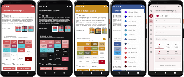
Flex Color Scheme is a Flutter package designed to simplify the creation and application of beautiful, Material Design-based themes. It offers flexible color scheme management with support for both light and dark modes, enabling developers to easily customize visual aspects like primary, secondary, and accent colors. The package provides pre-defined theme templates and allows for deep customization while maintaining design consistency across platforms. Ideal for apps requiring dynamic theming and modern aesthetics.
Use cases
- Creating responsive UIs with light and dark mode
- Customizing Material Design themes
- Building apps with consistent color schemes
- Implementing dynamic theming in Flutter apps
- Designing visually appealing interfaces
- Supporting multiple platform designs
Key features
- Built-in light and dark mode support
- Extensive color scheme customization
- Predefined theme templates
- Cross-platform theme consistency
- Easy integration with MaterialApp
- Flexible theme composition
Suitable for
- Flutter developers seeking modern UIs
- Apps requiring theme switching
- Designers working with Material Design
- Projects needing consistent branding
- Teams focused on user experience
- Developers wanting rapid theme implementation
Considerations
- Requires understanding of Material Design principles
- May increase app size slightly
- Best used with Flutter 3.0+
- Limited to Material Design components
- Needs careful planning for complex themes
- Depends on proper configuration for optimal results